Last week, Twitter updated its official Android app with more functionality and UI problems than we’ve ever seen.
It’s no secret that the official Twitter app for Android has been… neglected. Not in the sense that it doesn’t receive notable updates, because it does. However, the way the app looks and feels is its biggest downfall. Compared to some 3rd party Twitter clients, there should be no reason to use the official app. But Twitter has something else up its sleeve…
Why is this a big deal?
With Twitter’s API limits introduced in late 2012, it’s getting harder and harder for 3rd part developers to keep their apps in the Play Store. If you haven’t heard, if a new Twitter app enters the Play Store, it only has 100,000 tokens available. If an app already has more than 100,000 users, they get to double their tokens, then get shut down.
Since the most recent update, I have never seen so many disappointed users. You would think that if they’re putting a cap on users to 3rd party apps, they would focus a little more on the app that they are (essentially) forcing people to use. We’ll talk more about that later.
The UI isn’t the main problem. Though it’s bright and a little bulky, it’s usable. You should begin to see the differences when it starts holding you back from doing things more quickly, and more efficiently.
Functionality
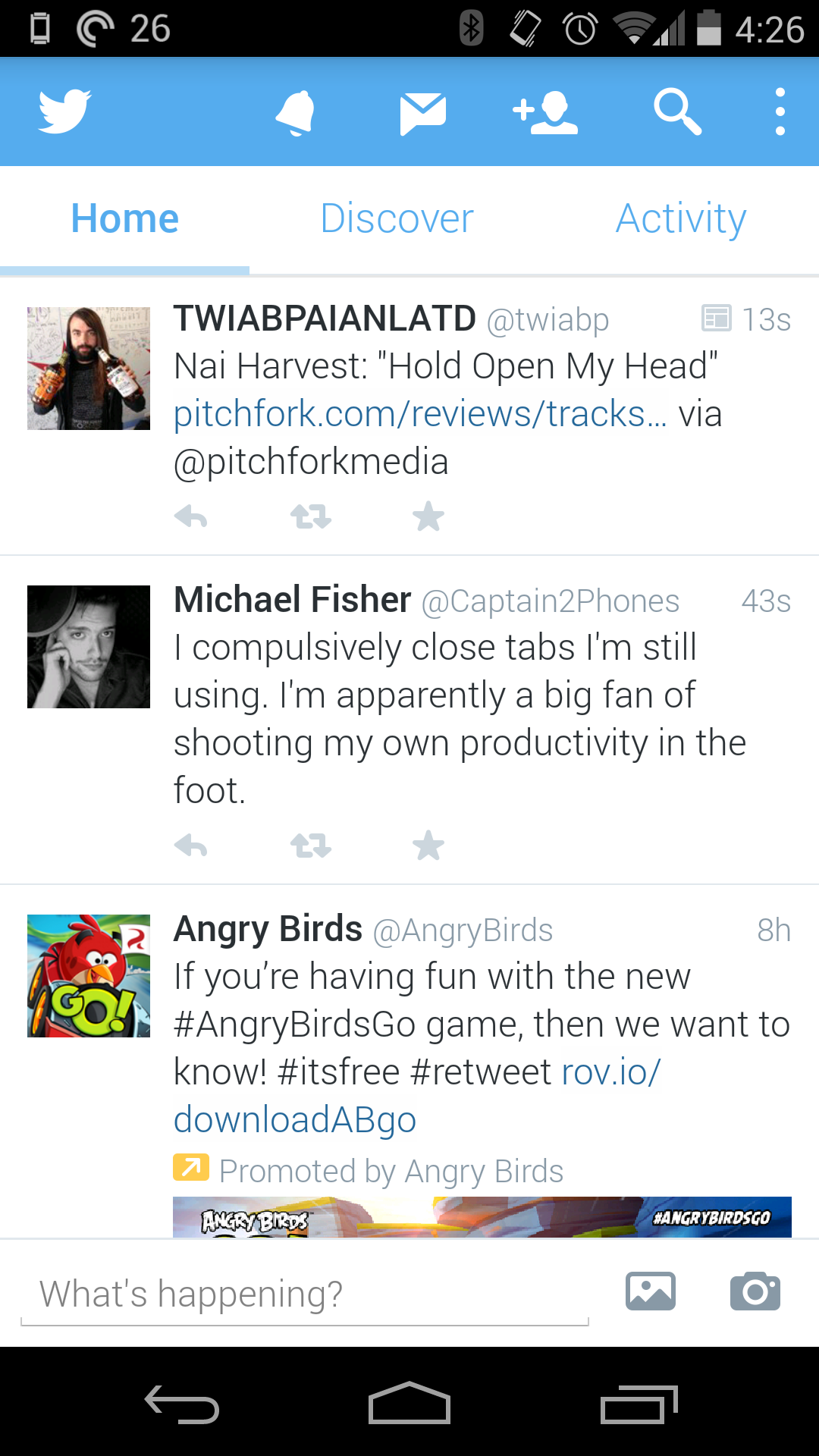
When I use Twitter, I read my feed, tweet, and find new people to follow. While you may use it for something more intensive, I usually stick to just that. The features of it that I use the least are Discover and Activity. Actually, I haven’t met anyone who uses them frequently, at all. The reason why I bring this up, is because perhaps the easiest way to navigate somewhere in an app, is by sliding tab to tab, from left to right. But, in the official Twitter app, they did this:

These tabs are accessed by swiping from left to right. In my opinion, these should not be placed here. The most used features are only accessed by tapping on them on the top of the screen.

While using this logic, shouldn’t they be switched around? Yes. They need to be. Take a look at some other apps that are doing it correctly, including Falcon Pro, Plume, and Tweedle:
Falcon Pro

(If you’re planning on downloading Falcon Pro, you can’t from the Play Store. This app is the first that has been removed due to Twitters limits. You can, however, download it from its official website, found in the above link.)
Plume

Tweedle

Widgets
The benefit to having an application on Android is the ability to use widgets. Especially with Twitter, most of the time you don’t even need to open the app if you have one on your home screen. Try not to laugh when you look at the comparison between the official and 3rd party widgets.

As you can see, the official Twitter widget resembles the UI from something that came out of the Gingerbread days, while the Plume widget blends in with just about anything that it sits next to. Why have they been neglecting this feature so much? No idea. But, here’s to hoping they update it sometime soon.
Final thoughts…
Not many official social network apps have a smorgasbord of customization options, but that isn’t the point. Don’t make a bad app/widget in the first place, and people won’t be resorting to other options. Also, if you’re going to have rules banning other apps from getting more users, you better be sure that yours is on-point. I think that’s the main thing that bugs me. Odds are, writing about this won’t change API limits or get Twitter to change their minds about anything. All we can really do is make suggestions, rate it on the Play Store, and hope for the best.
How do you feel about all of this? Are you using a different Twitter app? If so, we’d love to hear your thoughts in the comments!
The post Thoughts on the new Twitter UI appeared first on AndroidGuys.