A splash of color. That’s how Google’s first official design language kicked off back in 2014. Material Design was unveiled at Google I/O 2014, introducing a colorful set of guidelines that strove to create consistency in the world of Android apps.
“Material Design is inspired by the physical world and its textures, including how they reflect light and cast shadows,” according to Google’s Material Design website. “Material surfaces reimagine the mediums of paper and ink.”
Third-party app developers took their time in following these guidelines for their apps, with some ignoring them altogether, but others in the Android community took it as gospel. It was quick to shun apps that didn’t adopt Google’s standards, and those that did were put on a pedestal. By 2015, many of Google’s core services utilized the Material Design language. Eventually, this design expanded to Google’s services on the web and on Apple’s iOS.
“Material surfaces reimagine the mediums of paper and ink.”
The design of these apps were “fresh and very opinionated,” Matias Duarte, vice president for Design at Google, said in a meeting with several journalists during Google I/O 2018. Take a look below. Google heavily embraced the use of color, giving each of its apps a specific tone to identify with. Google Fit had a red and orange icon, and the app featured orange accents; Google Play Newsstand was filled with purple highlights.
-
1.
Google Play Newsstand, left, Google Play Store, right. -
2.
Google Fit, left, Google Now, right.
But gone are the colorful days of Material Design. You may have noticed Google has been updating the look of its apps throughout the year. There’s a new font it’s using called Google Sans, but more noticeable is the lack of color in all these redesigns. At the panel, Google’s designers said the use of white space will allow the product to shine, but color is still present, and it’s being used to highlight meaningful actions.
“Color remains an important design tool and brand signifier within the Google Material Theme,” Duarte told Digital Trends in an email. “You will continue to see color being used meaningfully in the Google Material redesign of Google products — some specific examples include the red and blue selected states and icons within Gmail and Google Drive’s recent redesigns.”
Much of the color seen in these app redesigns are Google’s brand colors — red, green, blue, and yellow — which Duarte said are “intended to be used with purpose and intent, not for decoration.” When you see these colors in an app, it usually means there’s an action to go with it that’s being powered by Google. For example, the redesigned Google News app replaced Google Play Newsstand, and there’s no hint of purple anymore. The only color in the interface is the “Full Coverage” icon, which when tapped, curates a list of stories around the subject so you get all sides and not just your preferred sources. This is being powered by Google’s artificial intelligence, and it’s why it’s the only colorful icon in the app.
Google said in testing, users felt more positive about its brand when it used Material theme, judging it to be more useful and intuitive. Take a look below at a handful of redesigned Google apps within the past year. They all predominantly feature white, with color kept to a minimum.
-
1.
Google Play Store -
2.
Google News -
3.
Google Home -
4.
Android Messages -
5.
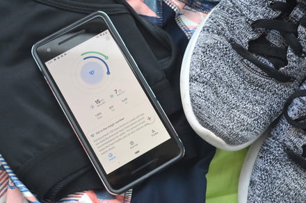
Google Fit -
6.
Google Photos -
7.
Google Tasks -
8.
Google Calendar
The use of white space does highlight the content in the product, and you can see where color is being used to highlight actions, such as the floating action button in the Google Fit app on the bottom right.
It’s not all pure white, though. Google has also added a “Dark Theme” to a handful of these apps, a consistent vocal request from the Android community. Duarte told Digital Trends that the team created a dark theme color palette for “Android Auto, Android Wear (now Wear OS), Android TV, and Google Cloud.” In the past year, we’ve seen this dark theme expand to the Google News app, YouTube, and even the Android Messages app.
There are still a handful of Google apps yet to adopt the new style, like Gmail (on mobile), Google Trips, elements of Google Maps, and Google Drive. Duarte said he hopes the redesigns will take place quickly — and they have for the most part — and it’s likely we can expect them to continue to roll out in 2019.
Editors’ Recommendations
- Keep Notes is the latest app to get Google’s Material Design makeover
- Google Fit hands-on: Bare-bones, but effective
- How to turn on YouTube’s Dark Theme for Android and iOS
- Opinion: Apple needs to modernize its antiquated annual app update routine
- Google Assistant gets a touchy-feely makeover, adds voice purchasing

