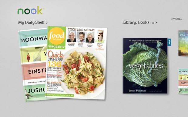
Barnes & Noble’s Nook readers are top notch — there’s no argument about that. The application part of that equation however, is pretty messy. The web app is integrated into the B&N site and keeps the UI clean and minimal. The Mac and PC clients on the other hand go with forest green highlights, grays and a busy sidebar for navigation, while the Android and iOS apps get bright blues and lots of gradients. And lets not even bring the Nook Tablet and Color into this. Basically, they’re all completely different, confusing and rather poorly designed. The company’s new Windows 8 app on the other hand appears to take cues from the Paper interface of the Nook HD which, while not exactly stunning, is certainly a huge step in the right direction. It also brings a certain amount of consistency to the ecosystem across platforms, something that’s been sorely missing. The current version is a little basic, as it appears the app lacks notation, look up and social sharing features, but it will let you pin content to your Start Screen as a live tile. Download it now at the source and check out the PR after the break.
Continue reading Nook app comes to Windows 8 with clean Paper-like design
Filed under: Software
Nook app comes to Windows 8 with clean Paper-like design originally appeared on Engadget on Wed, 14 Nov 2012 12:31:00 EDT. Please see our terms for use of feeds.
Permalink ![]() The Verge |
The Verge | ![]() Nook (Windows Store) | Email this | Comments
Nook (Windows Store) | Email this | Comments

